
How uptime is calculated
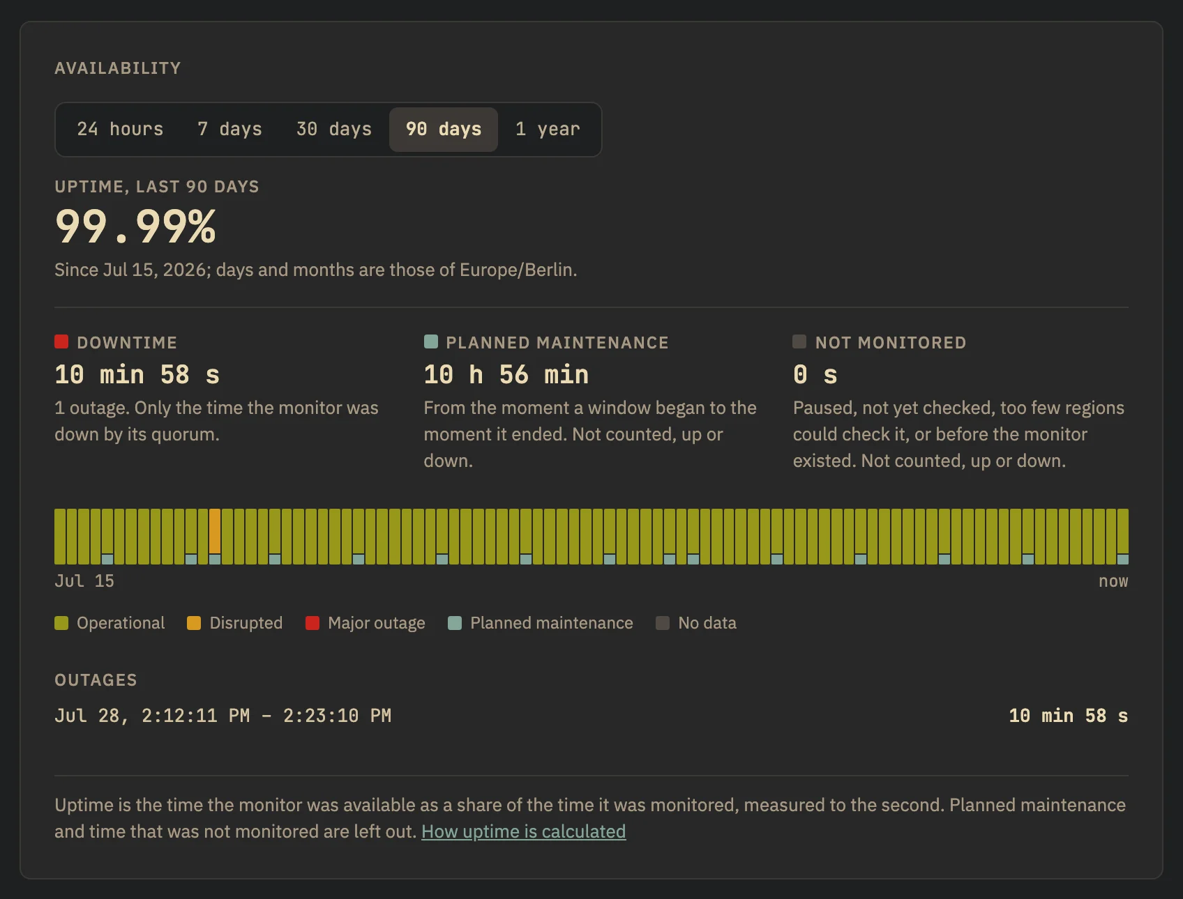
Uptime is measured in time, to the second: what counts as downtime, as available, as planned maintenance and as not monitored, and what the colours of the bars mean.
Heimdall measures uptime in time, not in checks. It keeps a record of the state each monitor was in and when, and every figure — in the app and on status pages — is read from that record.
uptime         = available time ÷ monitored time
monitored time = the period − planned maintenance − time not monitored
When nothing was monitored in a period there is no figure: you see a dash, never 0% or 100%. A figure has two decimals and is cut, not rounded: 99.9996% reads 99.99%, and only a period without a second of downtime reads 100.00%.
What counts as what
| Counts as | The monitor was | In the figure |
|---|---|---|
| Available | up, or degraded: a region failing below the quorum, or slow answers | Uptime. Degraded time is also shown as its own duration and colour |
| Downtime | down by its quorum, or flapping | The only thing that lowers uptime |
| Planned maintenance | Inside a maintenance window | Left out, from the moment the window began to the moment it ended |
| Not monitored | Paused, new and not yet checked, unknown (too few regions could check it), not created yet — or Heimdall itself was not watching | Left out: neither uptime nor downtime |
Downtime is what the quorum decided, not a failed check: one region failing while the others pass makes the monitor degraded, and a degraded monitor is available. See How quorum decides.
Measured to the second
A monitor changes state when its quorum decides so, and the change is booked at the time the deciding check was measured — not when its result reached us. An outage is as long as it was measured to be, to the second; a result that arrives late neither shortens nor lengthens it.
Durations are written in their two largest units: 45 s, 4 min 30 s, 2 h 5 min, 3 d 4 h.
Planned maintenance
A maintenance window is taken out exactly, from the instant it began to the instant it ended — not the hour around it, and not the day.
- A window from 14:10 to 14:20 takes ten minutes out of the monitored time
- An outage at 14:40 in that same hour is downtime, all of it
- An outage that began before a window and is still there after it is one outage; what of it lay inside the window does not count
- A monitor that was down only inside a window had no outage
Covered monitors are still checked while a window runs, so you see the service go away and come back. See Planned maintenance.
Not monitored
Time for which there is no evidence either way is left out like maintenance, and shown as its own duration. A paused monitor collects neither uptime nor downtime, and a new one does not start with a day of 100%.
The bars
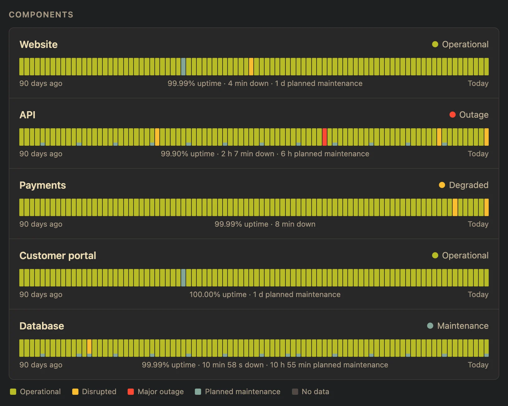
The monitor list shows the last 30 days, a monitor’s page 24 hours to a year under Availability, a status page 90 days. Each day — or hour, or month — has the colour of its level:
| Colour | Level | When |
|---|---|---|
| Green | Operational | No downtime, and at most 0.1% of the monitored time degraded |
| Yellow | Disrupted | Any downtime at all, or more than 0.1% of the monitored time degraded |
| Red | Major outage | Uptime below 95% |
| Blue | Planned maintenance | Nothing but planned maintenance is left of the day |
| Grey | No data | Nothing was monitored |
A day keeps the colour of what happened on it. Planned maintenance that ran on that day is a blue slice at the foot of its bar, as large as its share of the day and never too thin to see; only a day of which nothing but maintenance is left is blue altogether. Point at a day, or tap it, for its date, its level and its figures.
Days and time zones
In the app a day is a calendar day of your time zone (Profile), today included; the last 24 hours come in hours and the year in calendar months. Status pages are public and use UTC days. How far back the app shows depends on the history of your plan: a longer period is cut to it, and the app says where it starts.
The charts on a monitor’s page are something else
The response-time chart and the strip under it show what each region measured: response times, and the share of checks that succeeded. That share is not uptime. A check that fails in one region is not downtime, and a monitor can be 100.00% available while a region fails some of its checks.